Index
Info
OPS-Type ↗
de
en
fr
nl
se
Index
Info
OPS-Type ↗
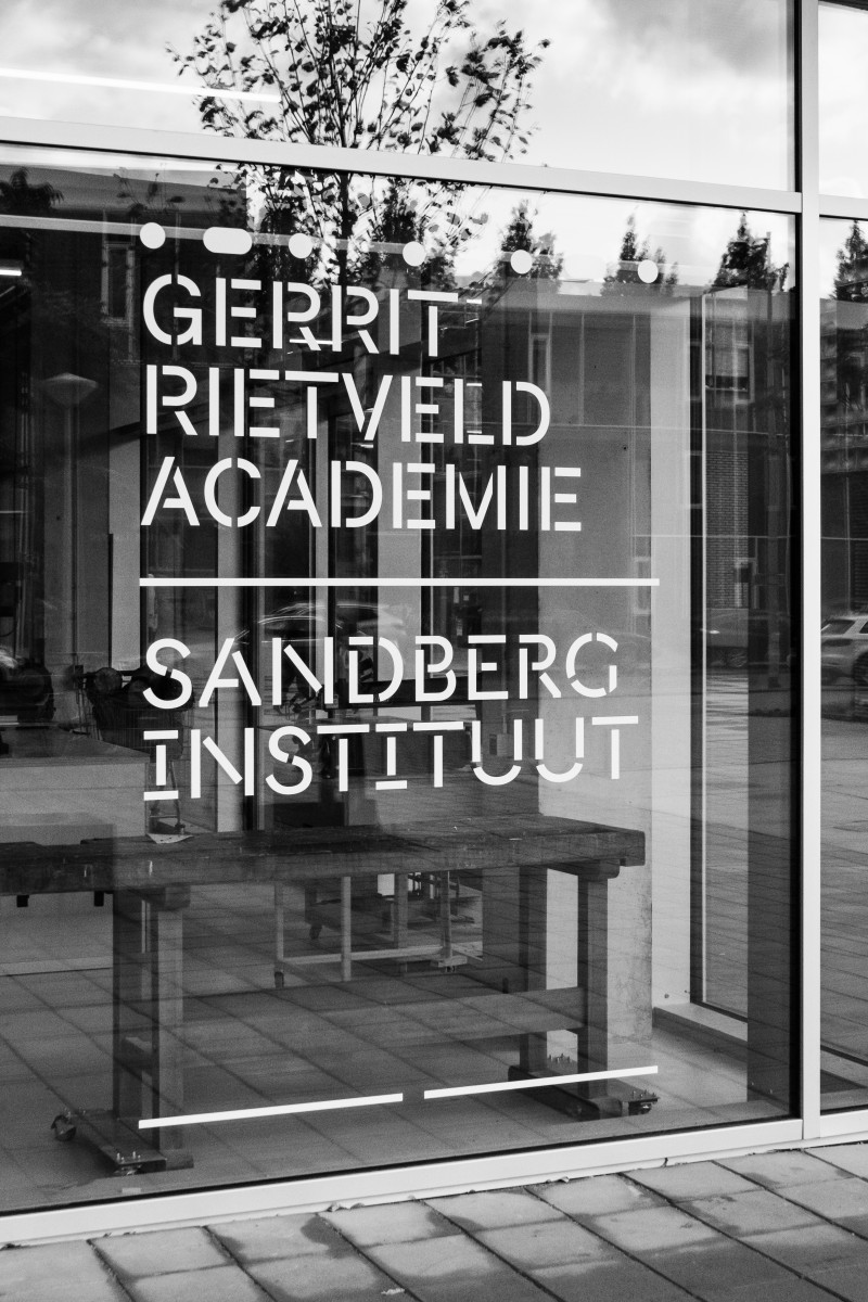
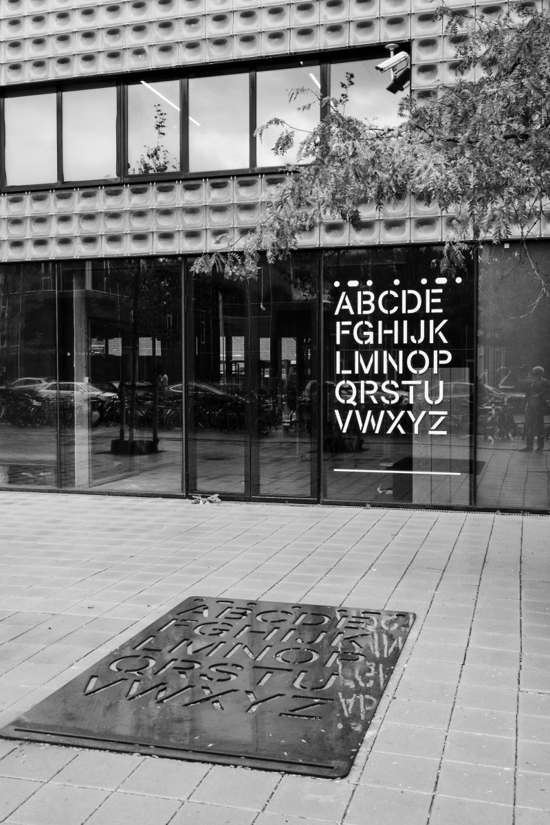
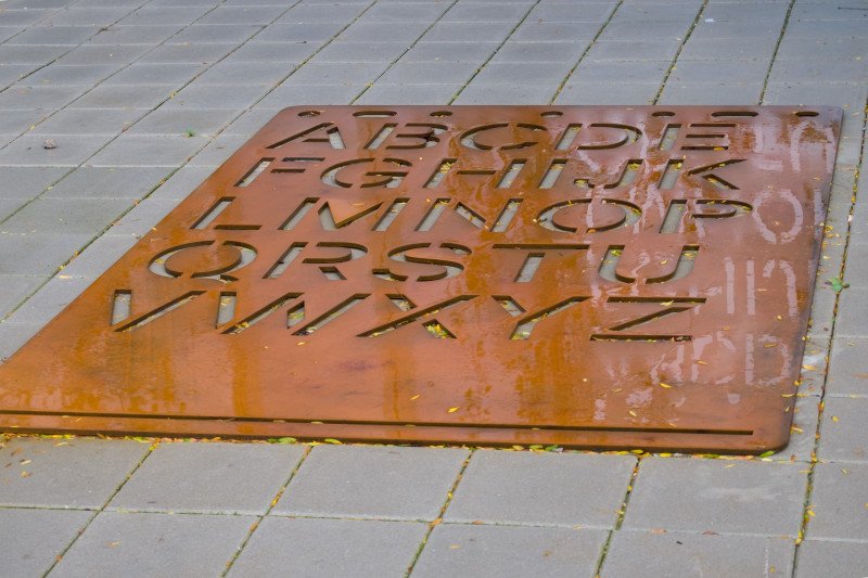
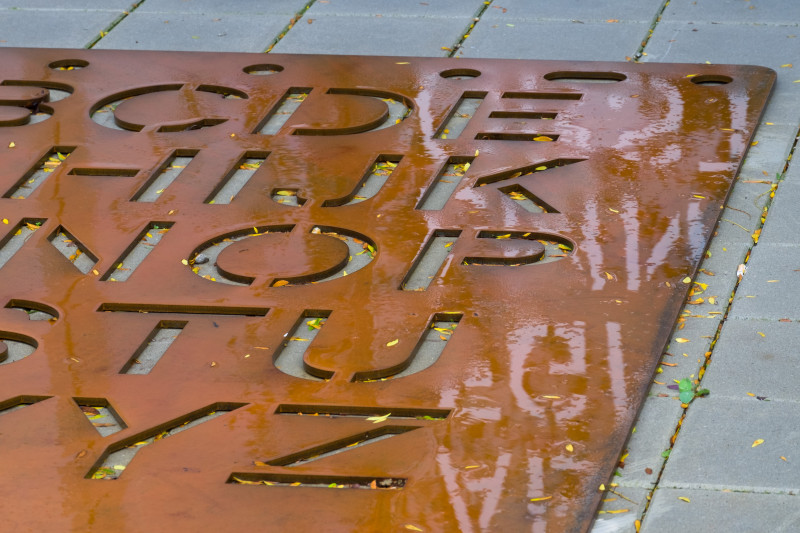
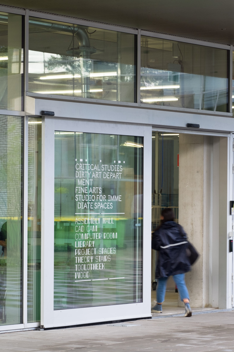
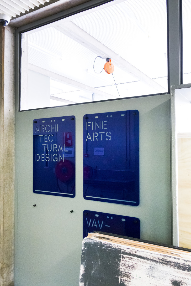
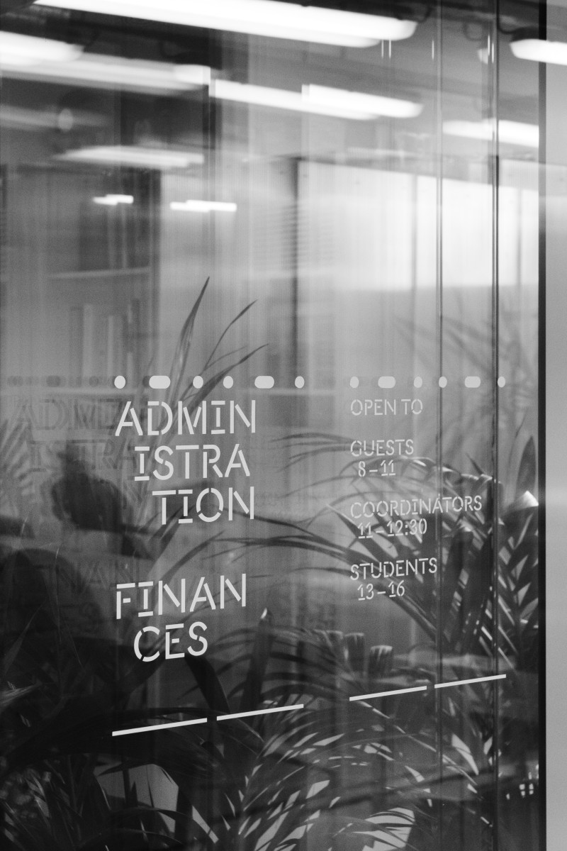
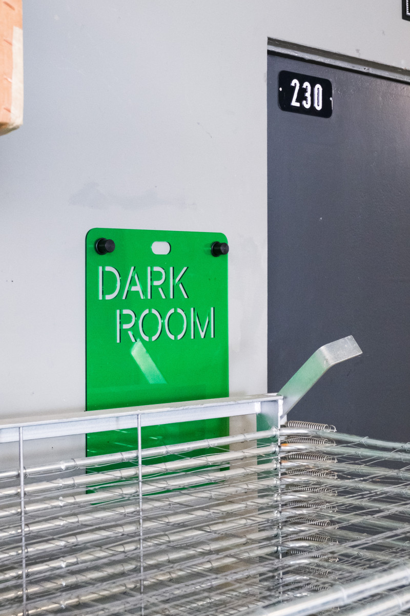
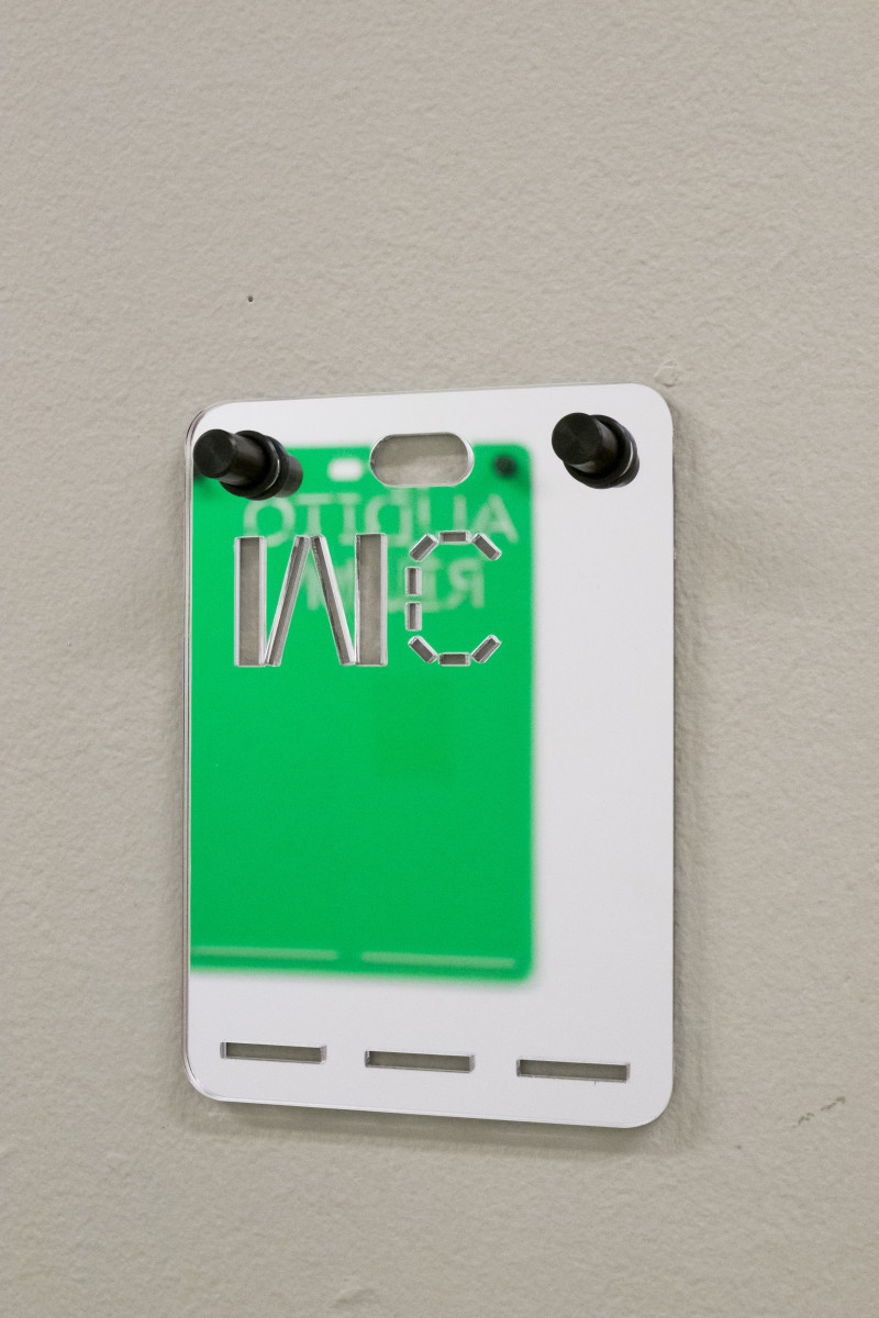
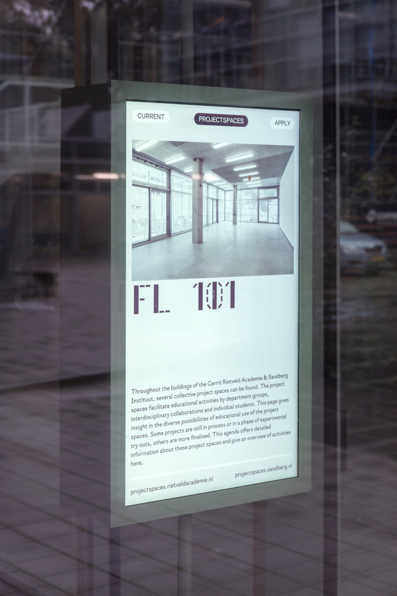
Rietveld/Sandberg Signage
de
en
fr
nl
se
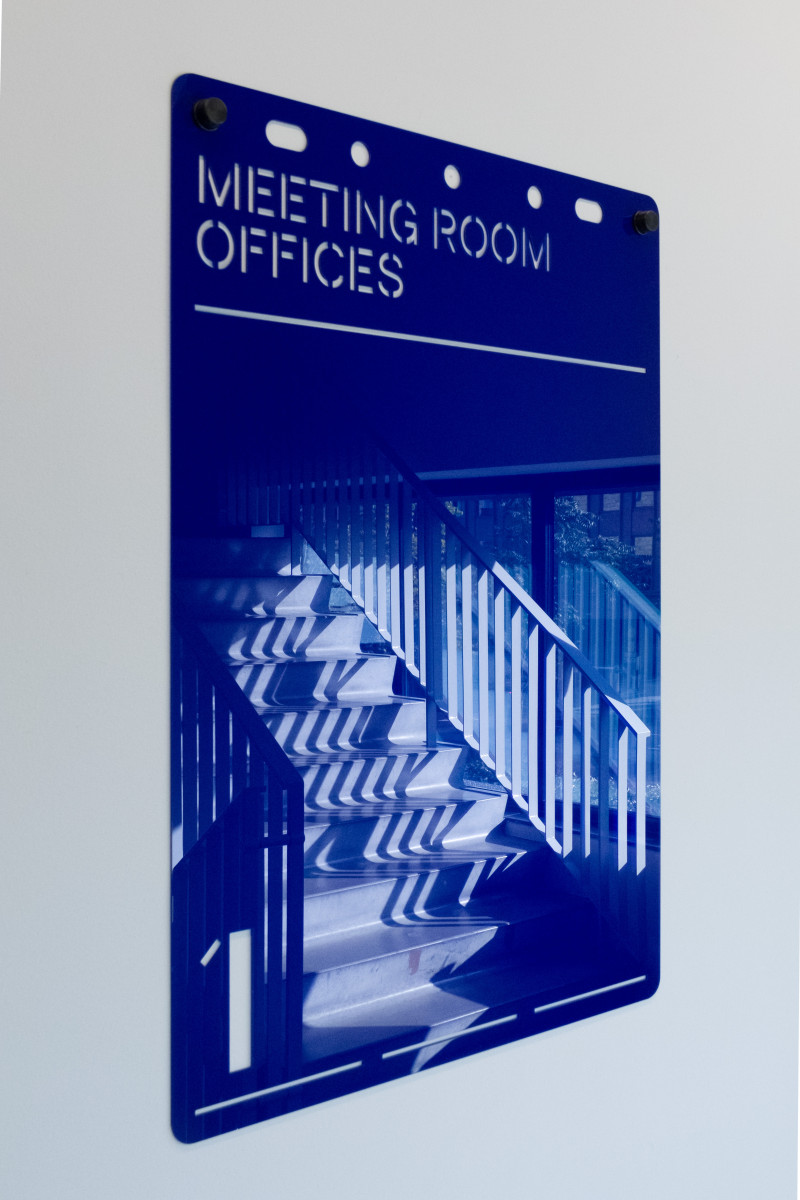
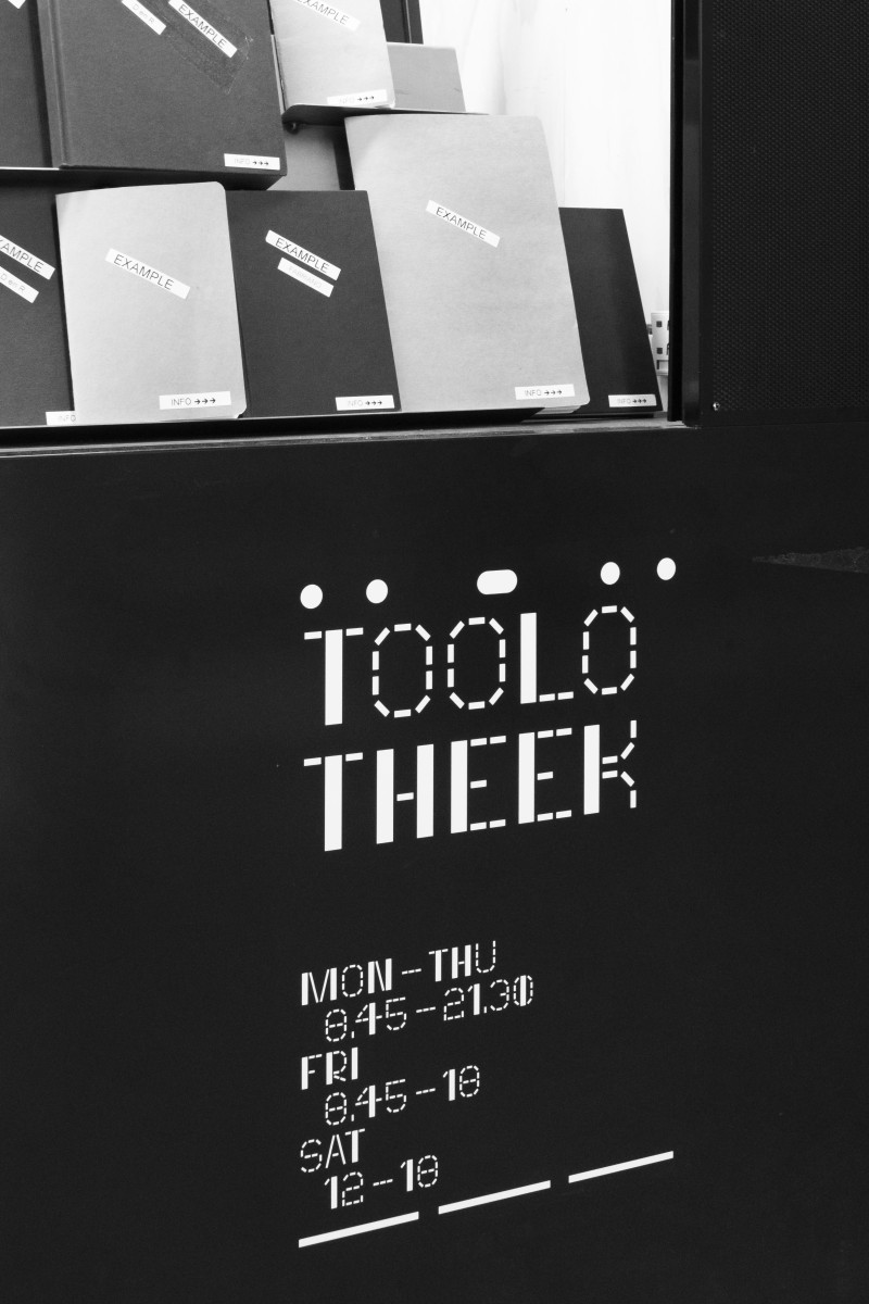
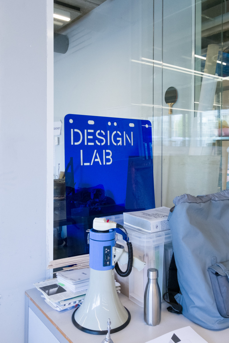
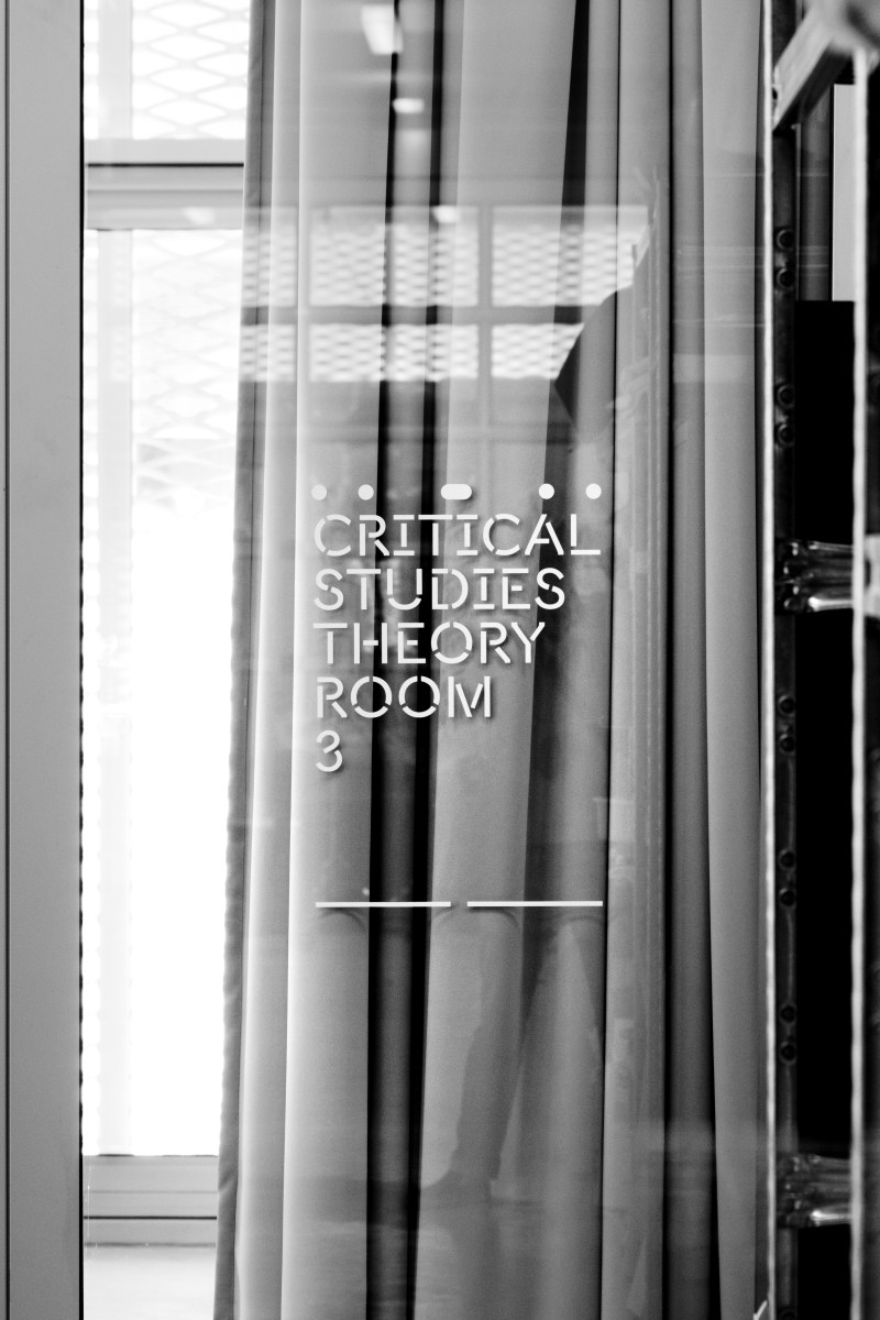
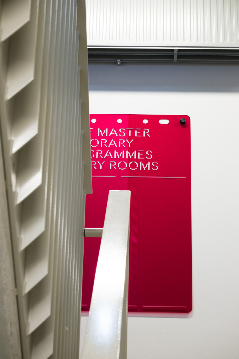
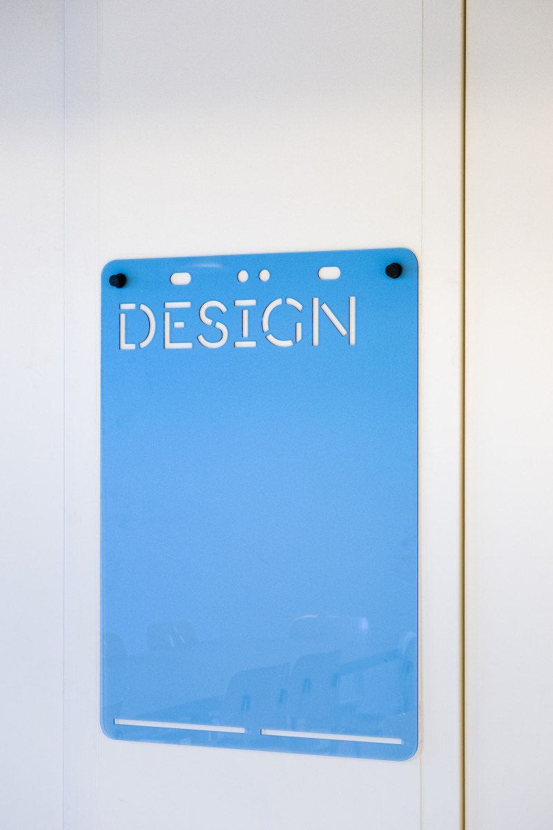
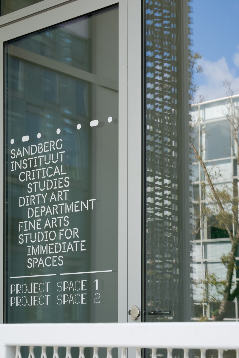
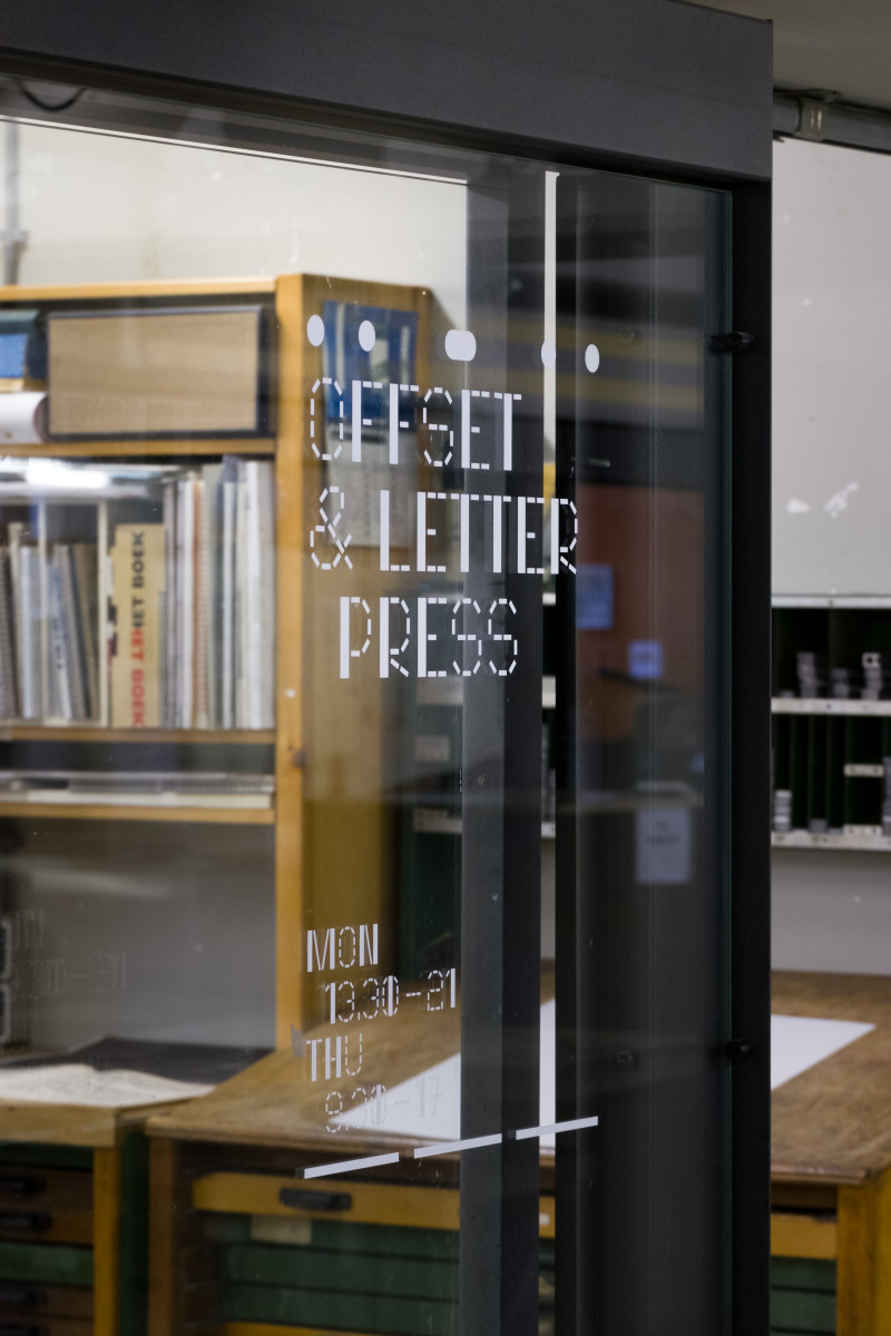
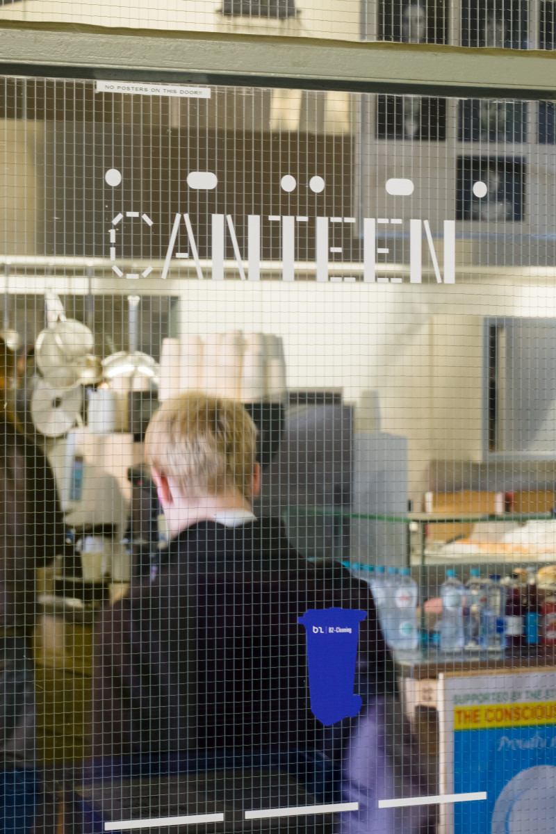
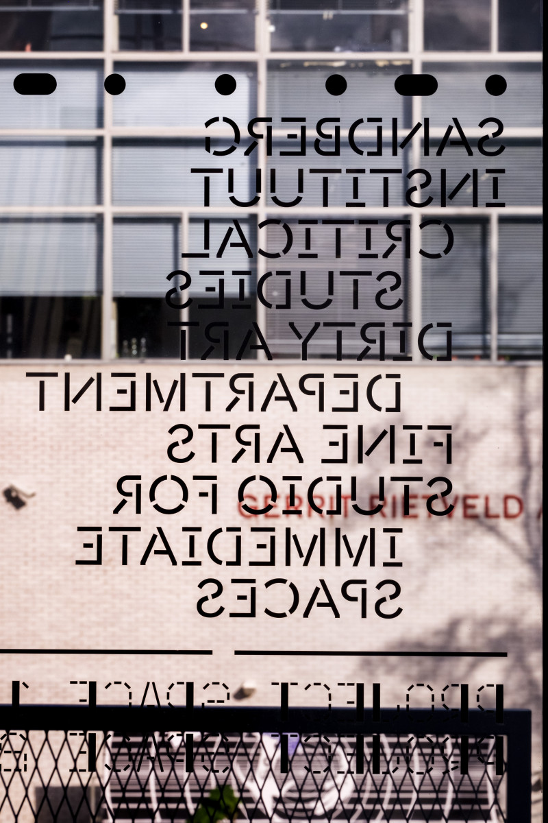
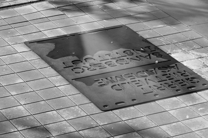
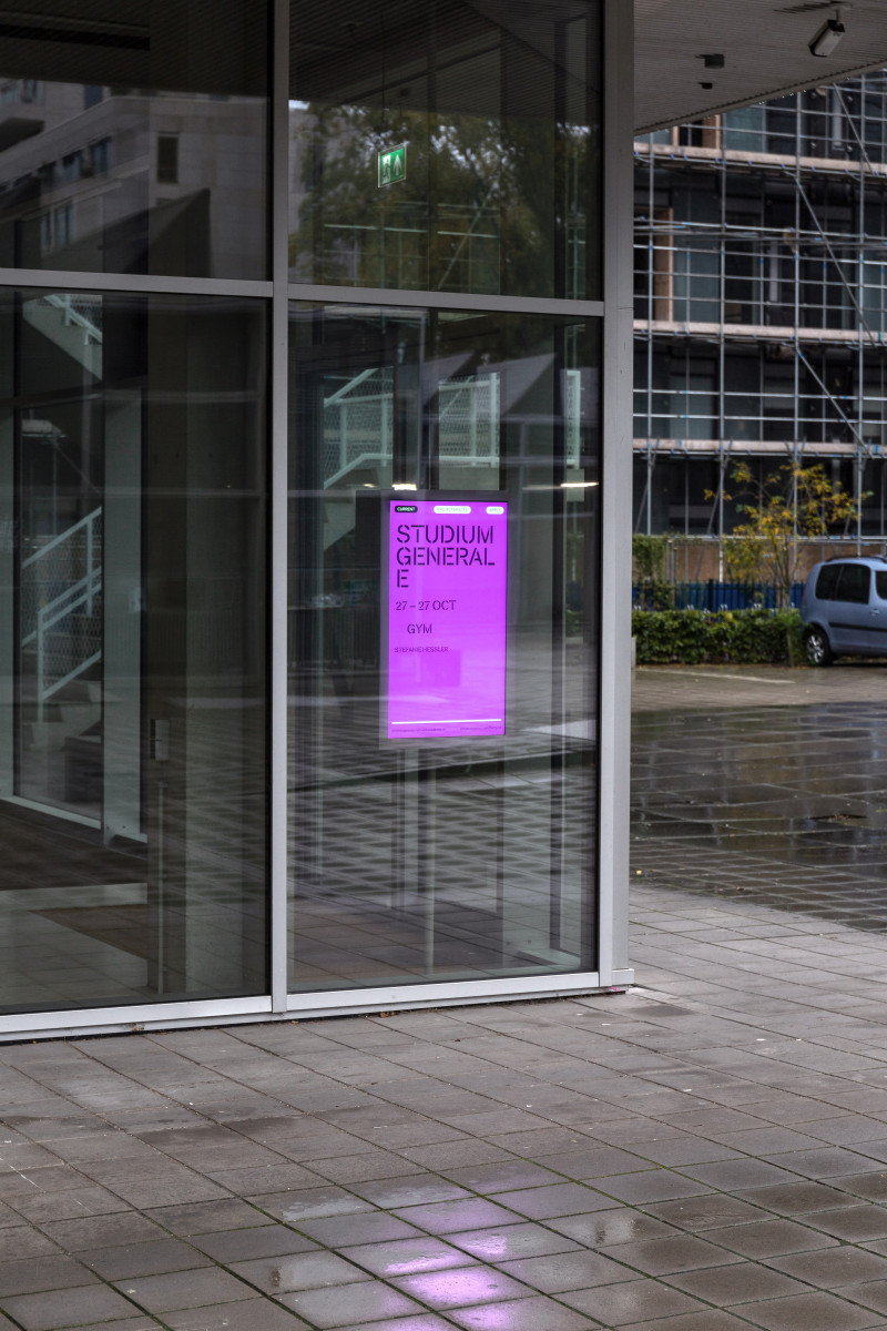
Projekt
Rietveld/Sandberg Signage
År
2020
Uppdragsgivare
Sandberg Instituut, Gerrit Rietveld Academie
Samarbetspartners
Johannes Schwartz (photography)
Kategorier
Signage
Type design
Website
Plats
Amsterdam (NL)